01 / Page detailUnify the header
● Before
● After

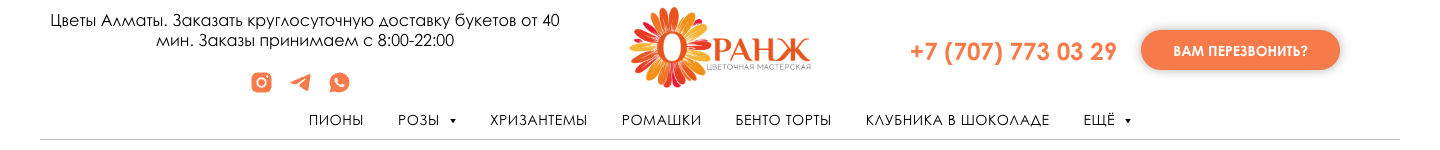
The header colours were softened and its visual weight was reduced, making the interface feel calmer, less distracting and more comfortable to navigate.
A focused redesign that makes a large, living flower store easier to browse and easier to buy from.
UX audit · UI redesign · Responsive review

Orange Flowers is an Almaty flower delivery store with a broad catalog, occasion-based collections, promotions and fast ordering support. The project was a light, focused redesign: make the existing storefront feel cleaner and easier to scan without rebuilding its business logic or technical foundation. A unified typography and colour system also made the refreshed identity easy to adapt for social media.
The store had grown into many categories, campaigns and page types. Useful content and actions competed for attention, while strong backgrounds, shadows and decorative elements made the catalog feel heavier than it needed to be. Different fonts and colours across pages also made the brand feel fragmented.
The updated peonies page shows how small visual decisions work together across a complete shopping journey. The existing structure and mechanics remain, while the presentation becomes lighter, quieter and easier to follow.
The header colours were softened and its visual weight was reduced, making the interface feel calmer, less distracting and more comfortable to navigate.


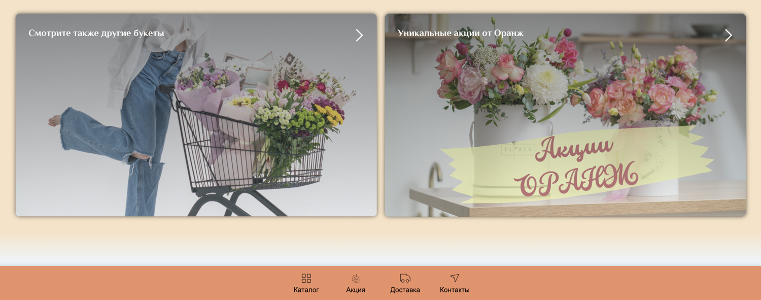
A large framed promotion was replaced by a category-specific hero that introduces the offer without delaying the shopping journey.


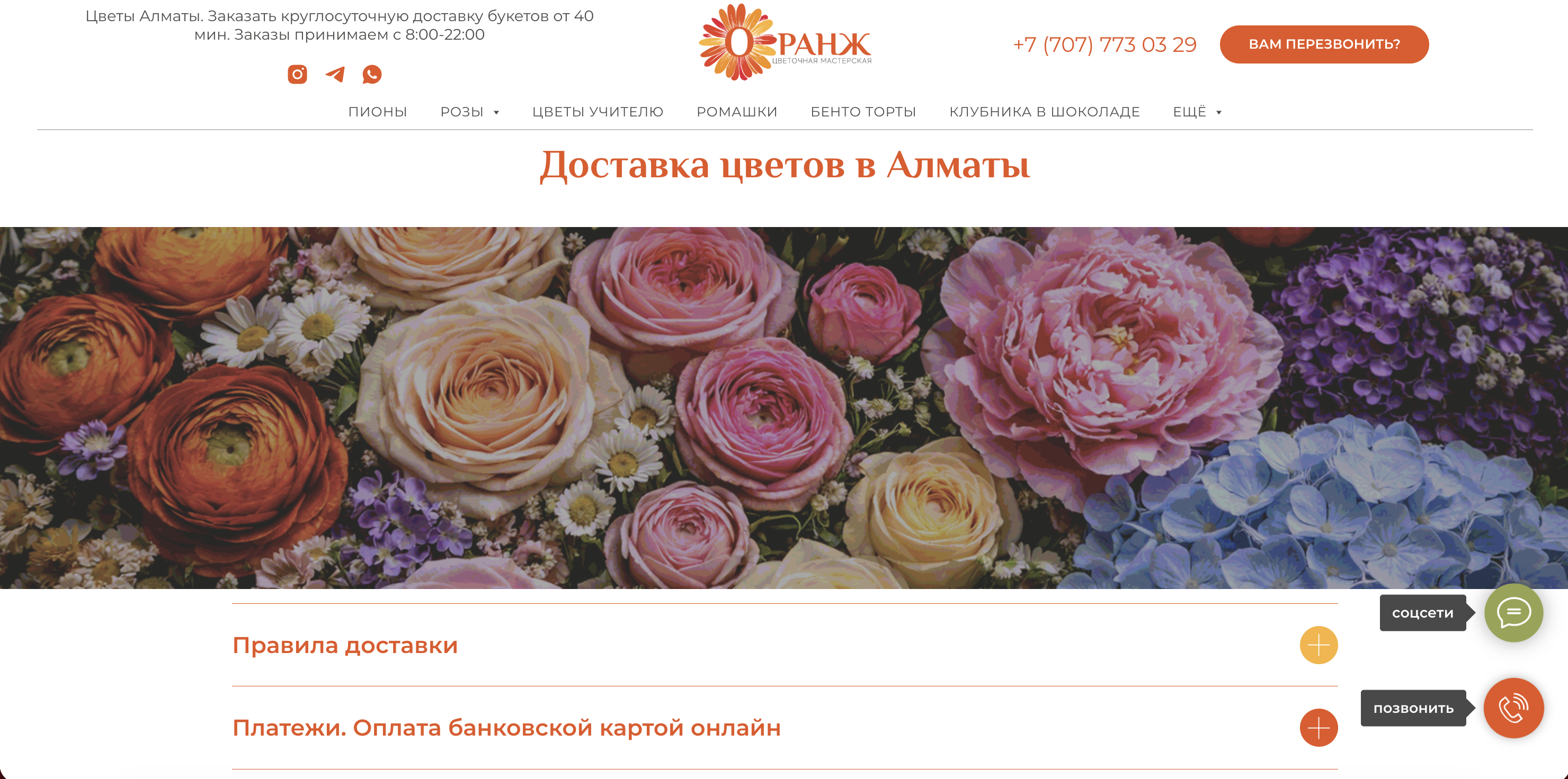
The disconnected orange warning becomes a calmer contextual service block with one clear action.

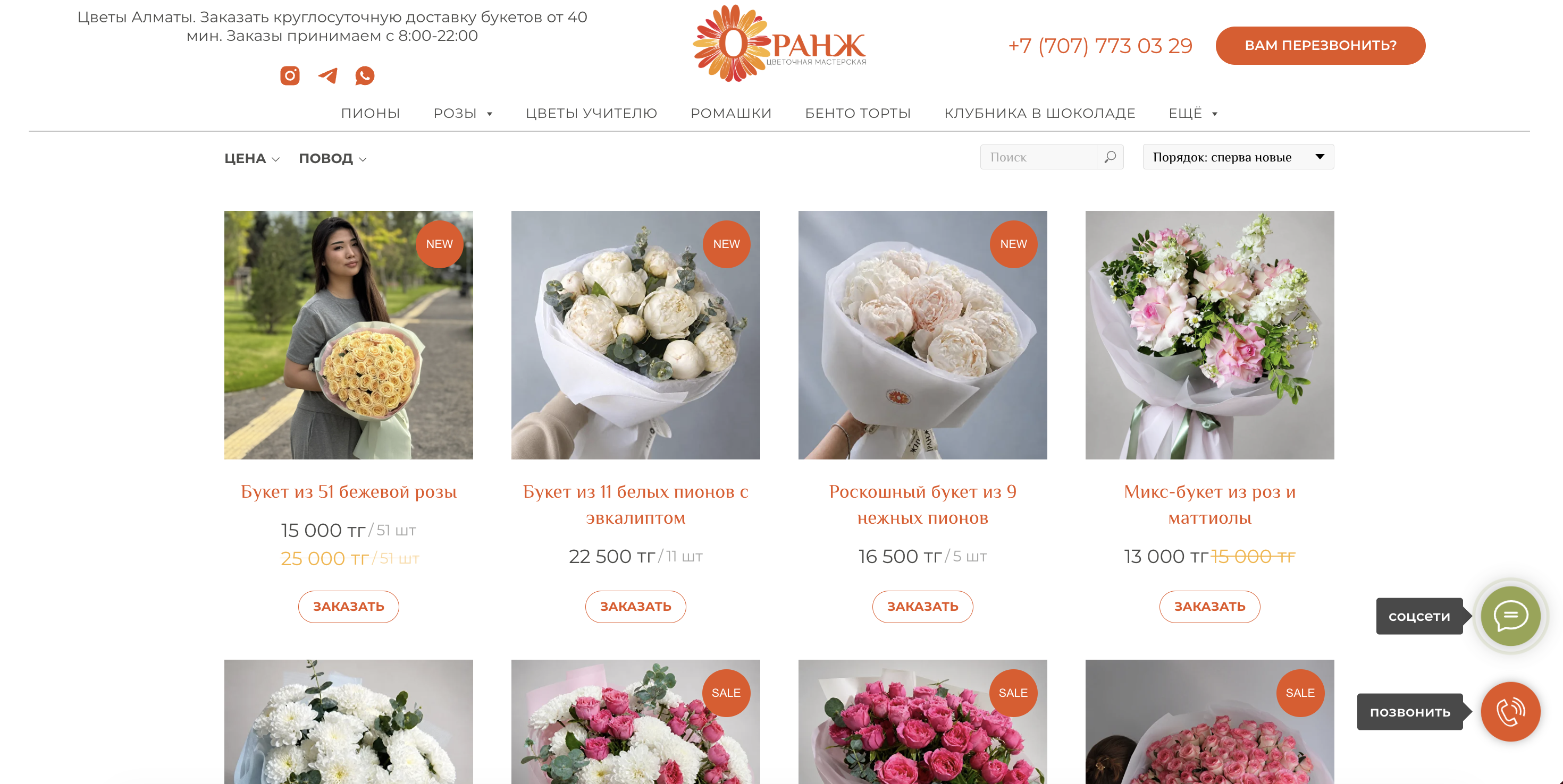
A new category navigation layer helps customers move directly to the relevant flower type or occasion.
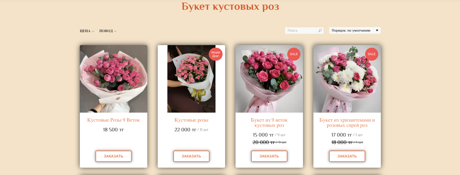
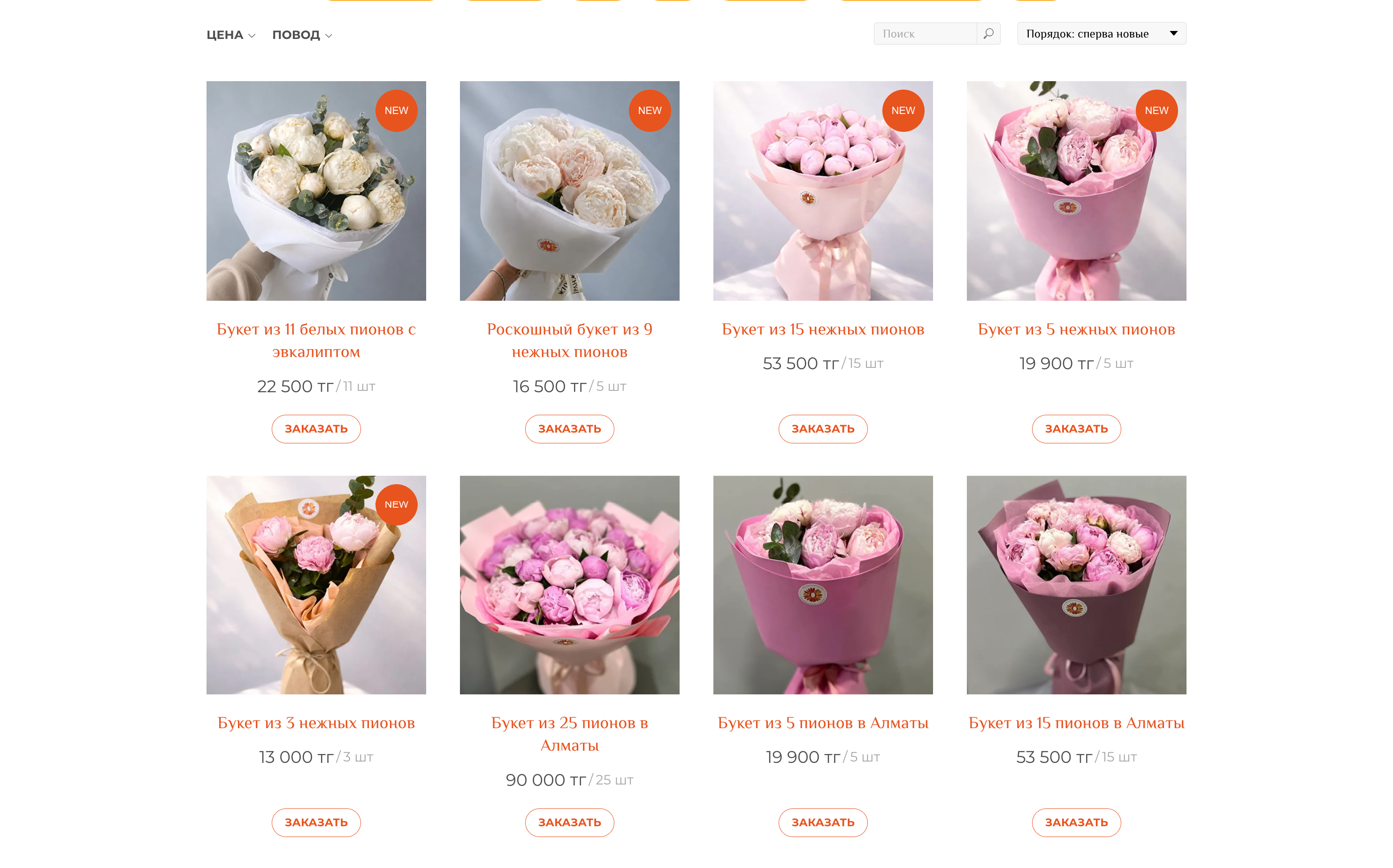
The catalog logic stays intact, while lighter cards and more whitespace create a clearer rhythm from product to price and order.
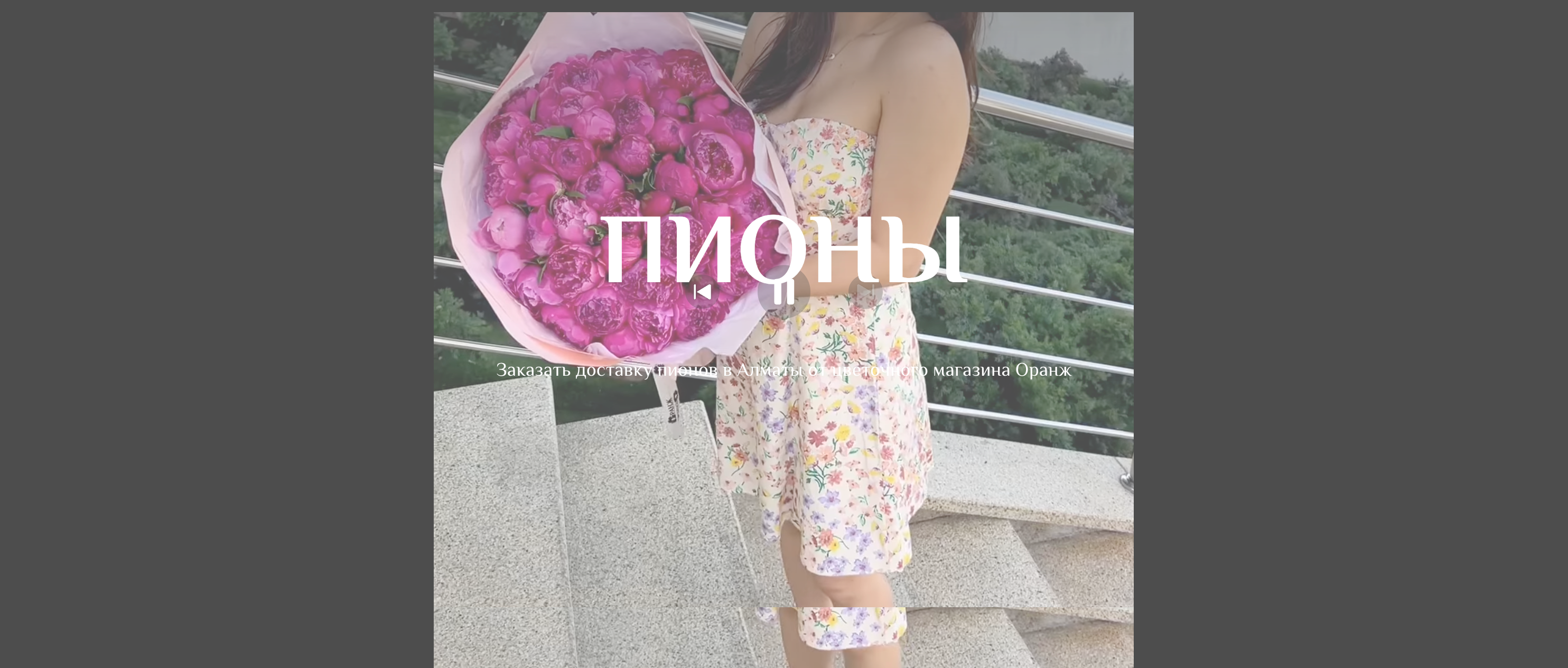
Generic supporting panels were replaced by a dedicated video visualisation that reinforces relevant search intent and stays connected to the category.
One typography and colour system replaces the previous mix of visual languages.
Fewer heavy shadows let the flower photography carry the page.
The simple visual system is easy to extend into reusable social media content.
Help people move through a large catalog without feeling lost.
Make ordering and support actions easier to notice and understand.
Give different commercial pages one recognisable visual and UX grammar.
Improve the storefront without disrupting existing SEO and commerce logic.
Reviewed the highest-value journeys, page types and recurring friction across the existing Tilda website.
Separated high-impact UX and visual changes from work that would add cost without improving the buying journey.
Replaced the mix of fonts and colours with one simple visual system, then refined spacing and product presentation around it.
Applied the lighter visual direction to catalog, promotional, delivery and support touchpoints.
Checked responsive behaviour and consistency inside the constraints of the existing commerce platform.
The solution did not ask the business to start over. It organised the existing offer, reduced visual competition and introduced one consistent typography and colour system across the pages customers use to discover, decide and order. Its simplicity also makes the identity easy to adapt for social media.
Occasion and category paths help visitors narrow a broad choice.
Promotions and delivery information support confident decisions.
Quick contact channels remain visible when a customer needs help.
The redesign created a more coherent storefront and clearer path through a complex product range, while preserving the website’s existing mechanics and operational foundation.
Working within the current system reduced implementation risk and avoided the cost of rebuilding useful commerce and SEO structures. Exact commercial metrics were not available for this case.
A useful redesign is not measured by how much changed. It is measured by whether the right things became clearer for customers and easier to maintain for the business.
This project reinforced the value of prioritisation inside a live product. With access to behavioural data, the next iteration would validate navigation choices and test the highest-traffic paths to order.
A private B2B product shaped across product ownership, UX/UI and frontend development.