Communication goal
Connect the craft behind the pastry with a clear, local invitation to visit.
Independent concept / Brand campaign & visual communication
Made by hand.
Closer to you.
A neighbourhood bakery, a city in motion, and a simple idea: bring the craft closer to the everyday route.
Explore the case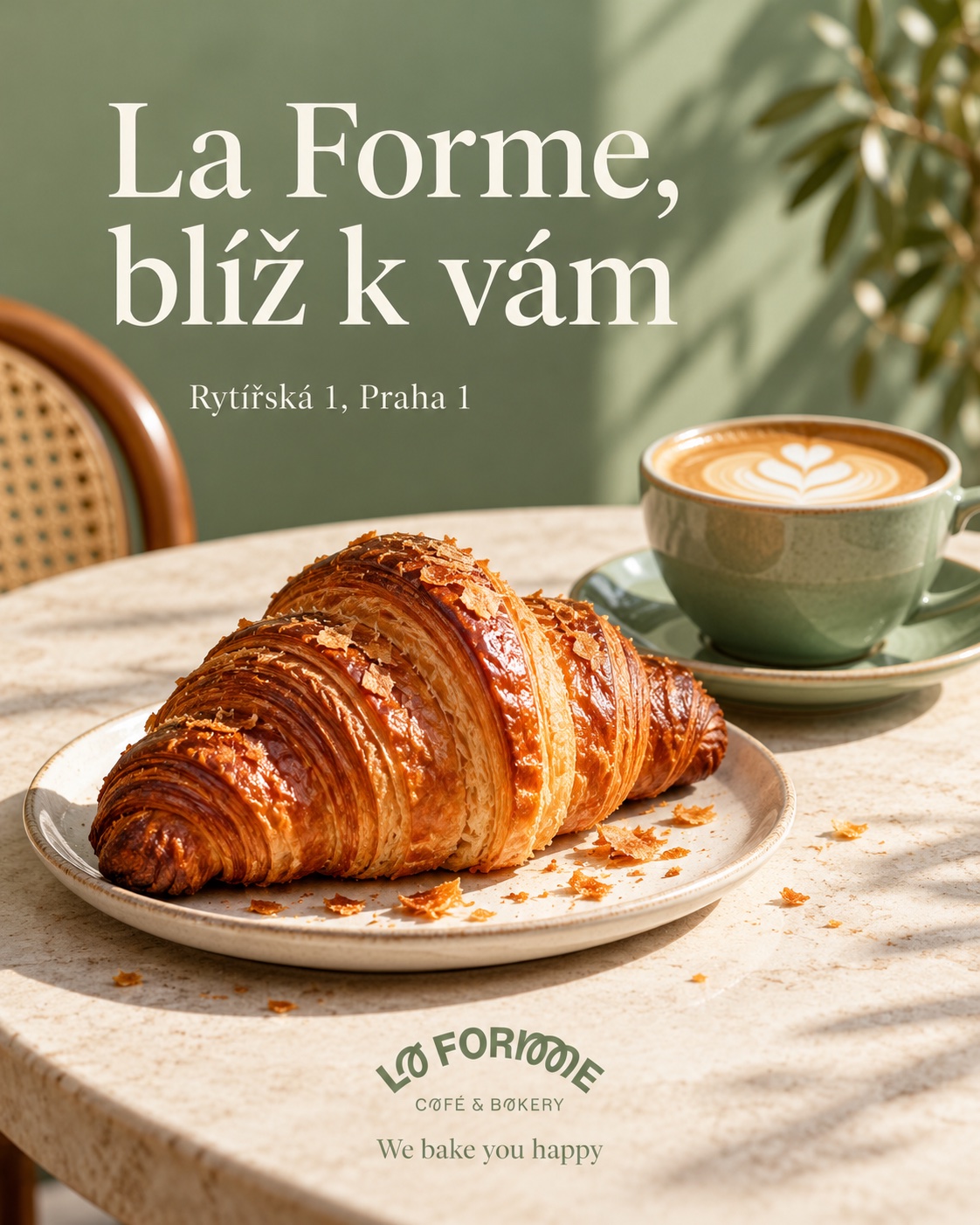
01 / The brief
La Forme already has a recognisable identity. The opportunity was not to replace it, but to imagine a campaign system that could accompany a bakery from one Prague neighbourhood to another — and still feel familiar on an ordinary morning.
Connect the craft behind the pastry with a clear, local invitation to visit.
People who live, work or pass near a bakery and are choosing a small daily ritual.
The existing La Forme mark, its soft green character and a warm, approachable voice.
02 / The idea
Z rukou
pekaře.
Až k vám.
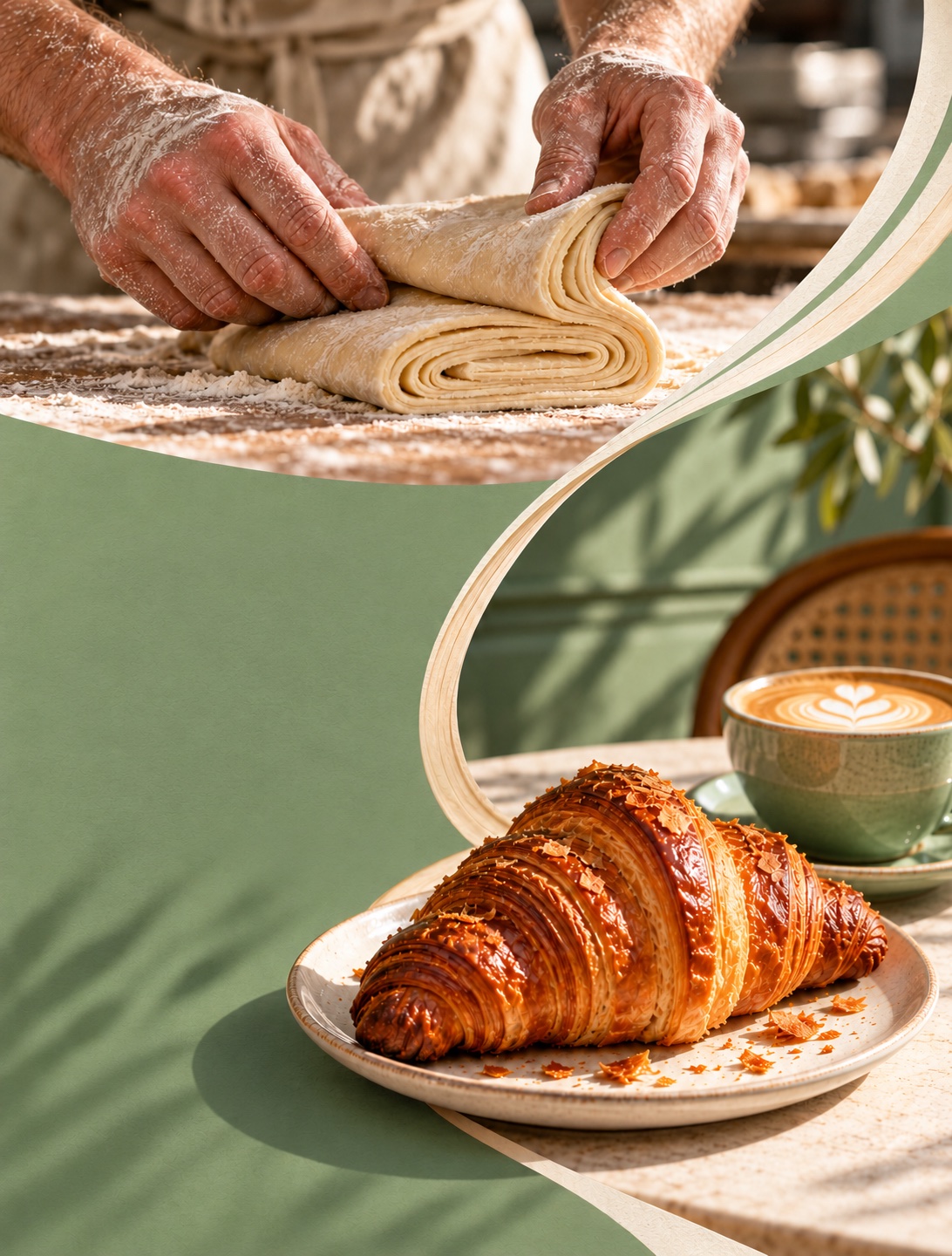
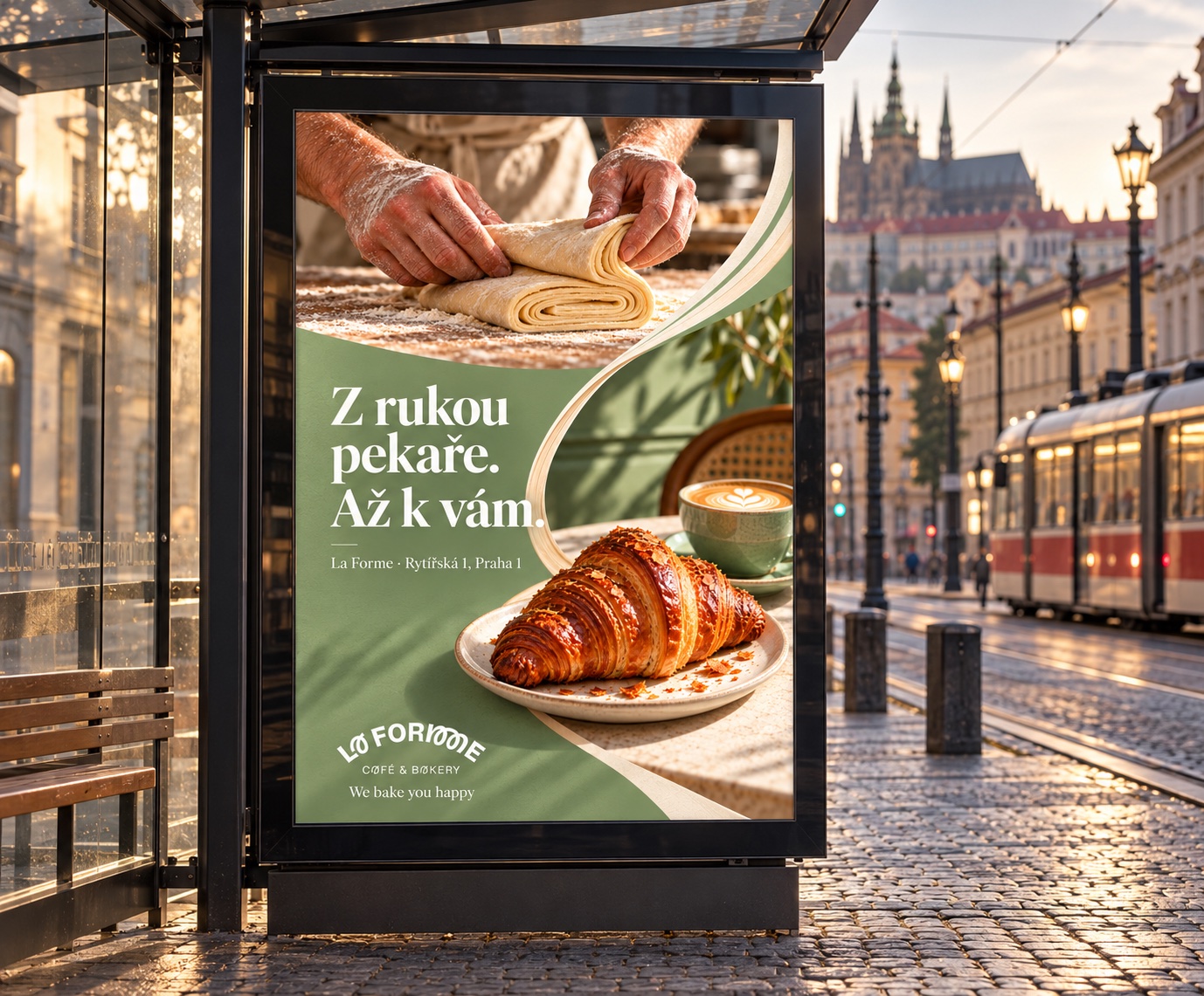
The line “Z rukou pekaře. Až k vám.” creates a bridge between making and enjoying. A curved form follows that journey: from folded dough to the route through the city, then across every campaign format.
03 / Art direction
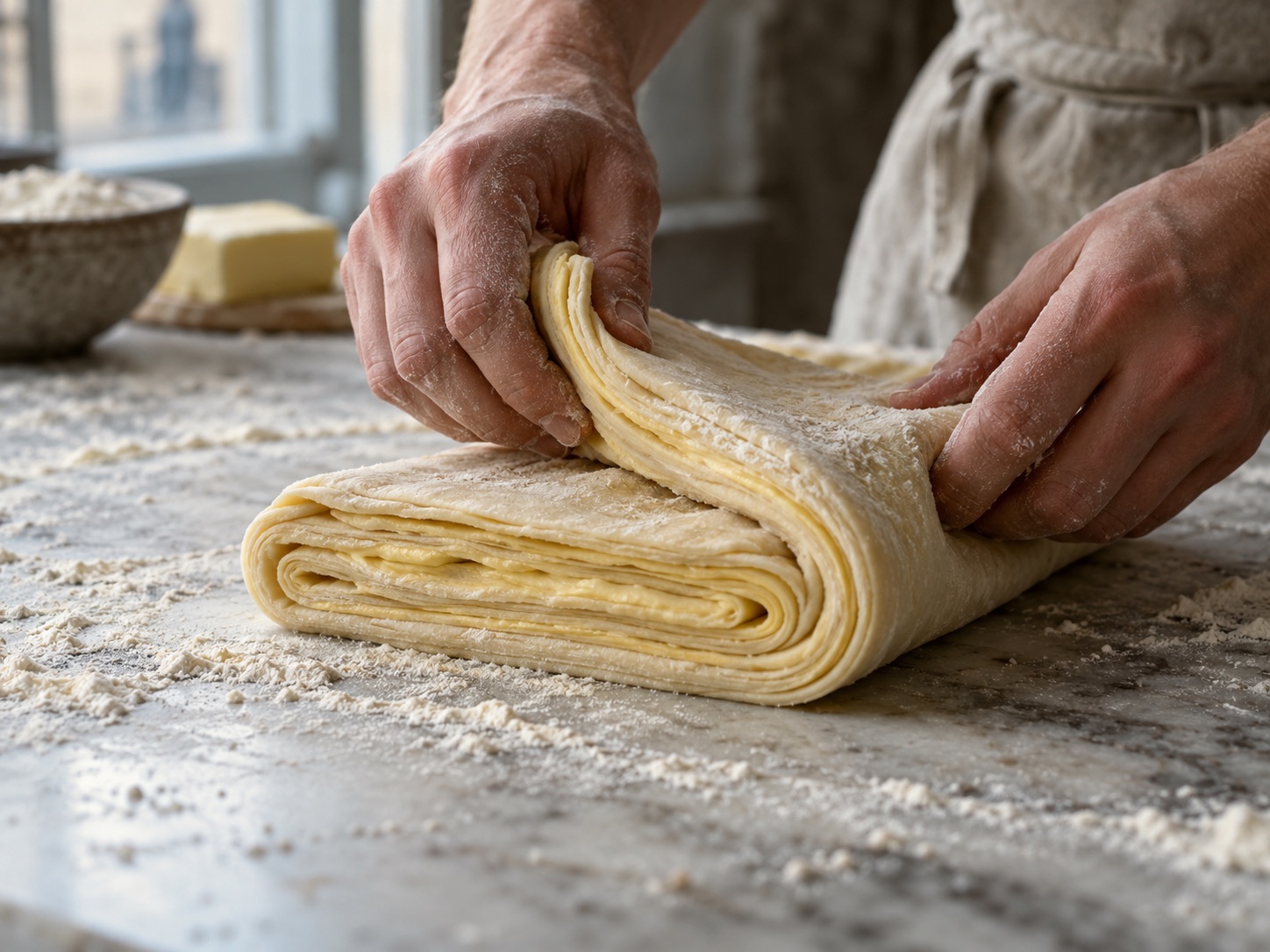
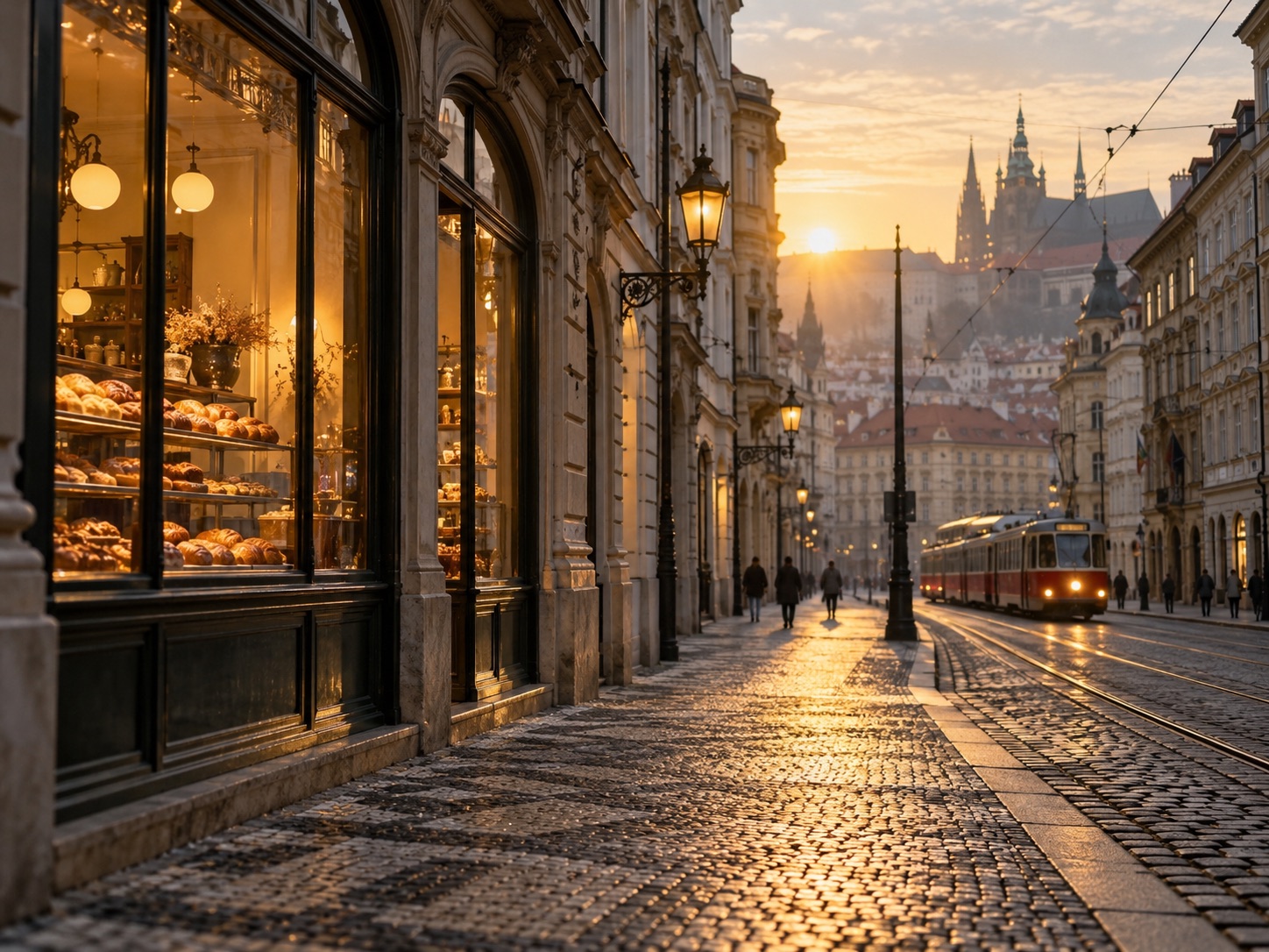
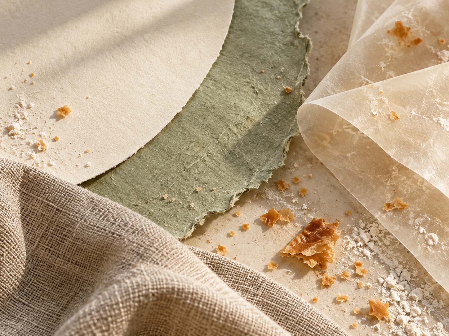
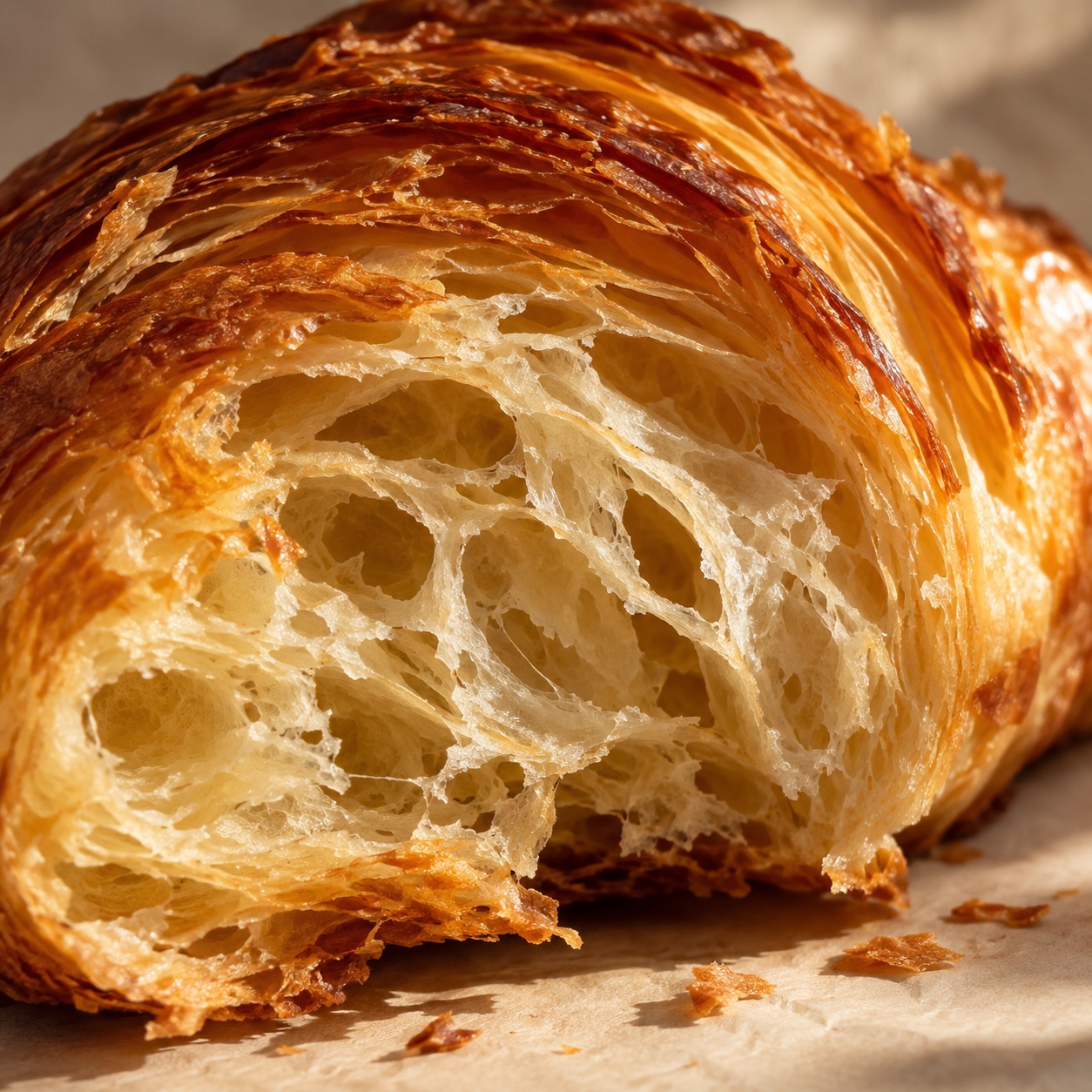
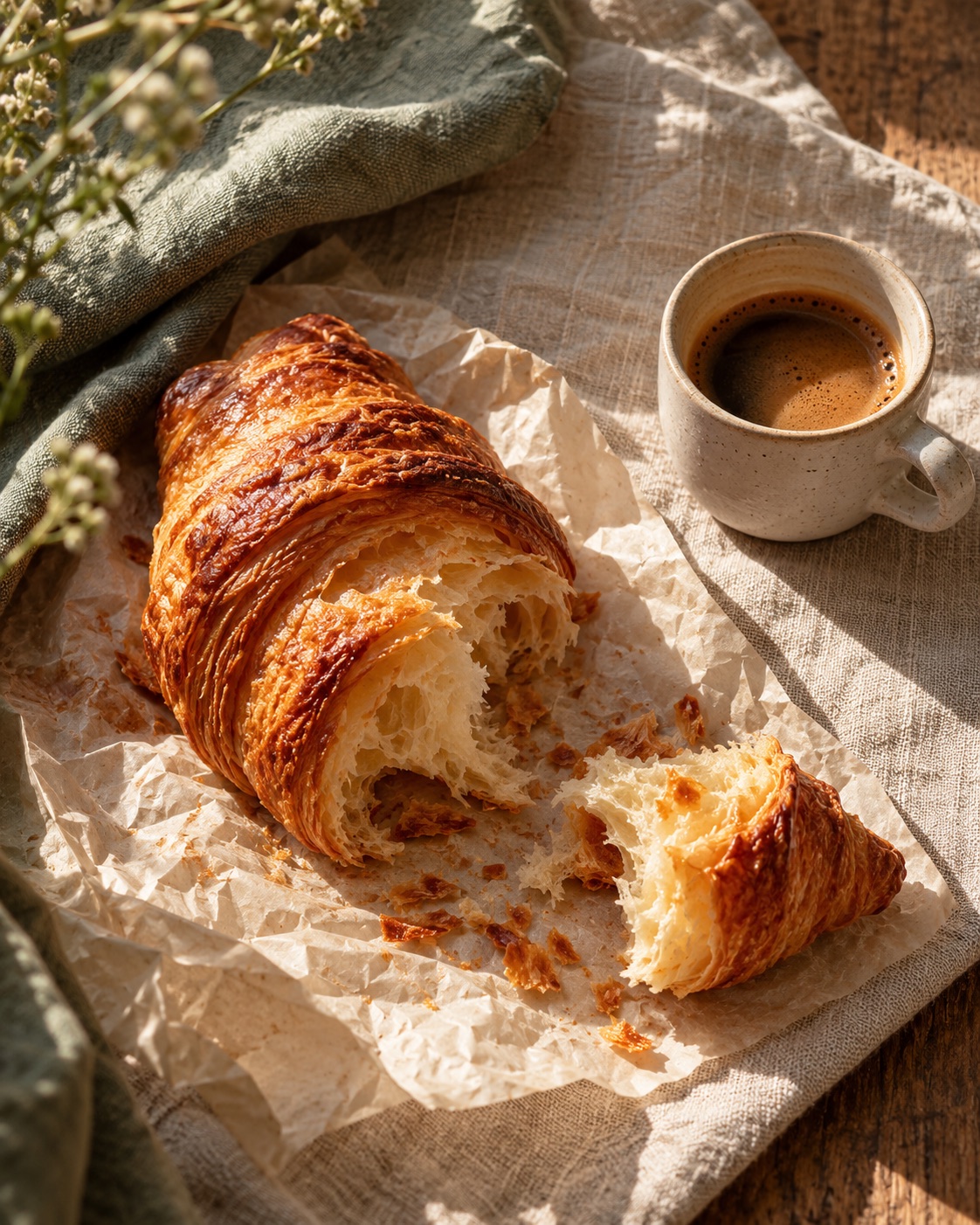
Hands, laminated layers, paper, morning light and Prague streets inform the visual language. The curves are not an extra logo: they are a flexible motif that frames photography, carries the address and repeats across physical touchpoints.
03.1 / COLOR SYSTEM
The sage is an approximate screen value sampled from the supplied logo image. The other shades are proposed campaign colors, not official brand tokens.
Suggested proportions for campaign layouts, not a pixel count of every mockup. Let the pastry bring its own warmth through photography.
03.2 / TYPE SYSTEM
The existing logo is a distinct mark, not something to reset in a new font. The campaign pairs a soft editorial serif with a precise, quiet sans. Czech diacritics are checked in every format.
Z rukou pekaře.
Až k vám.
Každý den trochu blíž. Řemeslné pečivo, výběrová káva a chvíle, na kterou se těšíte. Najdete nás v Rytířské 1.
RYTÍŘSKÁ 1 · PRAHA 1 / WE BAKE YOU HAPPY
04 / The campaign
The master poster is designed to read from the pavement: a short line, an unmistakable image and a real address. The same hierarchy scales from a shelter panel to a phone screen.
 We bake you happy
05 / Everyday touchpoints
A sage field holds the existing mark while nested olive arcs wrap around the box, bag, pastry sleeve and cup. The forms stay practical; the campaign language makes them feel like one family.
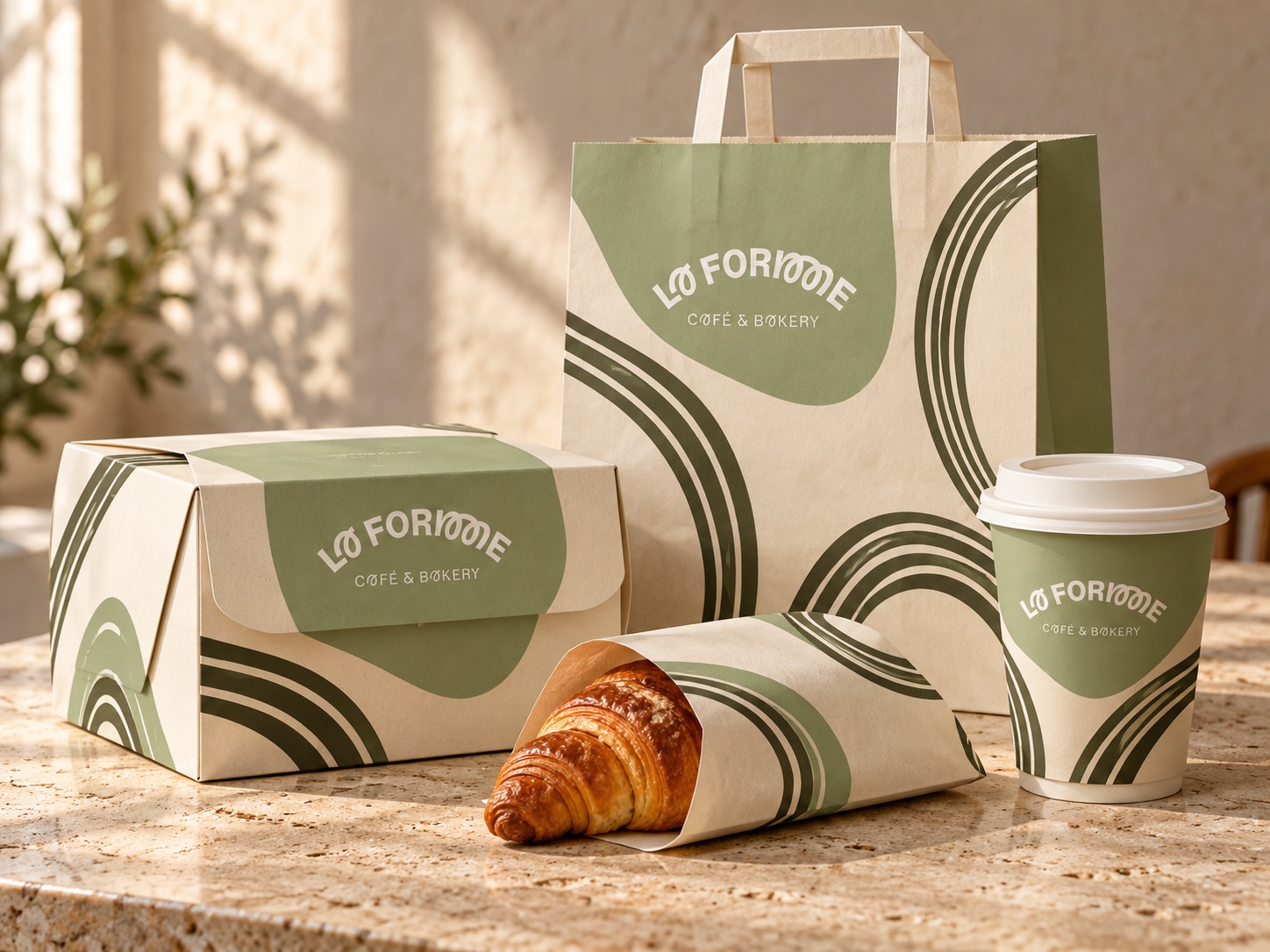
A generous field gives the existing mark a quiet, consistent place on every format.
Nested curves echo laminated pastry. They can run beyond the edge without changing the package structure.
The box closes, the bag has handles, the pastry sleeve opens at one end, and the cup remains standard.
05.1 / Small touchpoints
The existing mark and the croissant silhouette each get their own round sticker. An oval seal carries a short encouraging line for a box or takeaway bag.
05.2 / In-store communication
A sage cover and a small pastry illustration link the menu to the existing mark and packaging. Inside, categories, names and prices stay quick to scan at the counter.
CAFÉ & BAKERY06 / What the system proves
One visual idea can move between campaign and packaging while leaving room for each location’s real address and context. For a live launch, the next step would be to validate copy and production files with the bakery, then measure route taps and visits.
Brand reference: @laformebakery